
Enlightened
A downloadable game for Windows and Linux
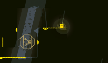
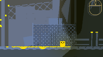
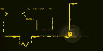
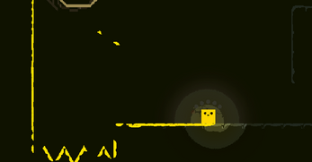
Enlightened is a platformer where the visibility of the level is limited to only where there is light. Fortunately, you play as a cube of paint that coats the level as you traverse around, highlighting safe paths, gaps, and deadly traps.
With each death a trail of paint will be left behind, allowing you to incrementally progress through the levels. The floor, walls, and spikes will be covered in a shower of paint highlighting your previous mistakes, making death an instrument in your progression.
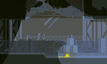
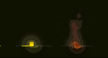
Each level makes full use of the game's dynamic lighting system, using a combination of environmental lighting and the lighting from the player to create stunning scenes for you to explore.
A deadly storm is approaching and you have limited time to reach the next safe spot. As the storm approaches, the environment subtly shifts into a darker tone, with the clouds growing denser and the rain starting to show...
Play for free now!
| Status | Released |
| Platforms | Windows, Linux |
| Rating | Rated 5.0 out of 5 stars (2 total ratings) |
| Authors | Miammiam, PowerfulBacon |
| Genre | Platformer |
| Made with | Unity |
| Tags | 2D, Casual, Dark, deathloop, Pixel Art, Short, Singleplayer |
| Average session | About a half-hour |
| Languages | English |
| Inputs | Keyboard, Mouse |
| Links | Source code |
Development log
- Windows BuildMar 04, 2024


Comments
Log in with itch.io to leave a comment.
Hey, I was just trying to polish the itch.io page for a project I'm working on before its release, but I'm having trouble with one thing. The download button for the project appears both at the top and bottom of the page, and it's placement at the top of the page looks ugly and out of place. I looked at some already existing forum posts, and they said it had to do with a long page length. However, they are outdated, and I noticed that the page for this game is just as long, or longer than mine, and has the download buttons at the bottom only. I am wondering how you did that or if it was a problem for you at all.
-Thanks.
The download button appears at the top of the screen if your screen width is smaller than a certain amount (so that its easy to use on mobile)
I see, that makes sense, but I viewed your page and mine with the same device, so wouldn't they both have a download button at the top of the screen? Also I played your game and the presentation is really smooth and atmospheric.
Not sure, might depend on if you have a banner or screenshots, or depend on the font size or something. I checked your public pages and they don't have the download button at the top for me.
Yeah, I'm not sure. I tried removing the banner and that didn't change anything. I'm not sure what is different in my new project, but I guess I'll just have to deal with it for now. Thanks for the help though!